- You should include a caption for your image stating the location that the photograph was taken and the photographer who took it.
- No matter the language barrier, magazine layouts have similarities wherever you go.
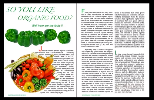
- For digital prints such as tablet or pc- single page starting pages (bottom image) are used instead of double page (top image) but not suggested for magazine layout for print.

 |
| Difference in layout between a digital print (bottom) and a magazine layout for print (top). |
- Digital devices are becoming increasingly popular. Technological convergence has meant software (the magazine article) can be accessed via hardware such as tablets which have become increasingly popular.

- Magazine such as GQ, Vogue and Wired now all have tablet versions of their magazines as applications which are digital editions of their magazine. Newspapers have also adapted to the technological advances such as The New York Times. Digital publishing editions allow the reader to interact with the article. For example some have links to videos and other forms of visual aid to increase interest to the article.
 |
| This is an example of a digital magazine layout. A slider at the bottom allows the reader to look through the magazine, clicking on an individual page to read it. |
- Below is a bad example of a double page layout as the imagery is only used on one side of the page making the article visually boring to look at. A huge bulk of text can be extremely off-putting for a potential reader.
No comments:
Post a Comment